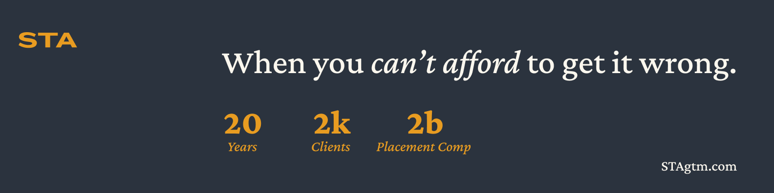
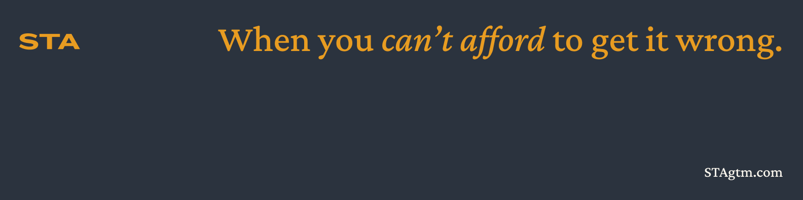
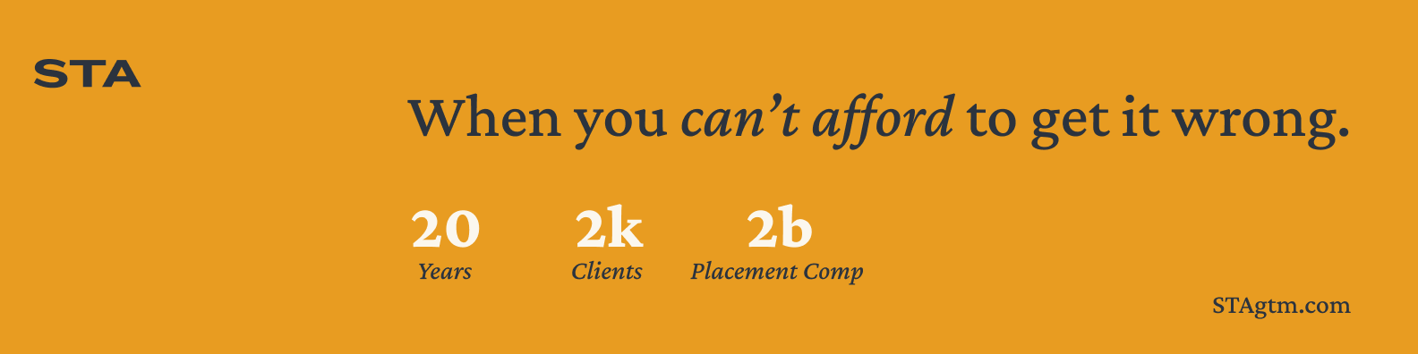
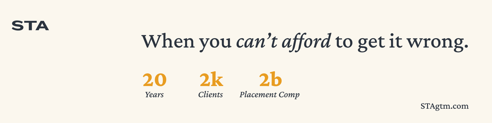
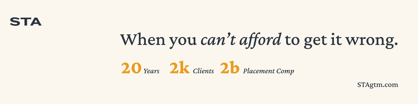
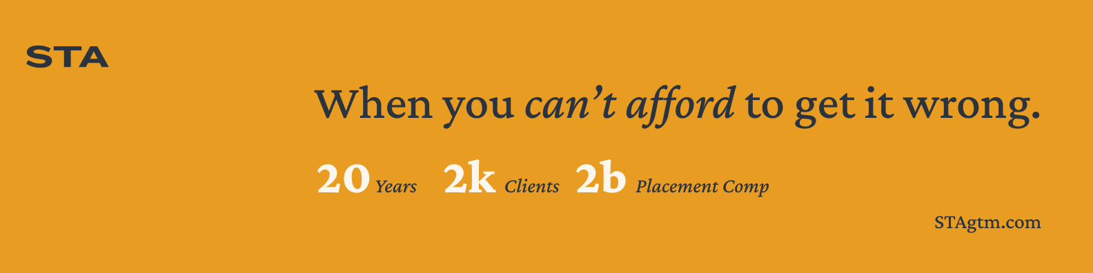
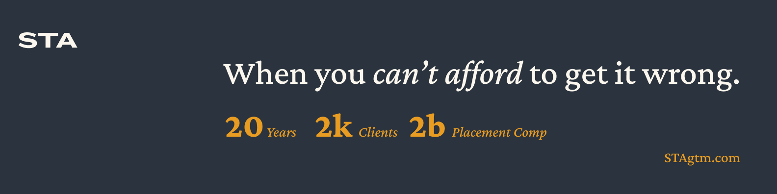
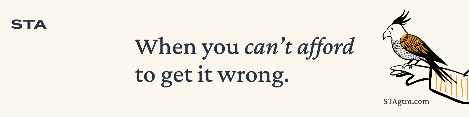
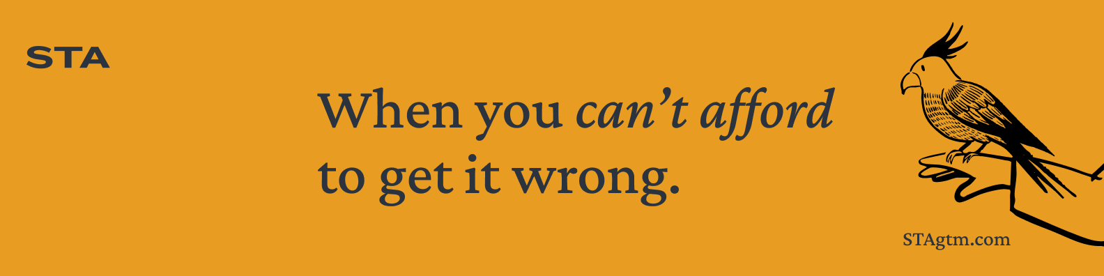
When you can't afford to get it wrong.
An interactive mirror of the STA Brand Guide. For the humans referencing it, for the AIs they're briefing, and for anyone checking whether an asset is actually on-brand.
How we sound
STA is the firm companies turn to for high-stakes GTM hires. We place decisive, influential talent in the most critical growth moments, when the clock is ticking, there's everything to lose, and the outcome is non-negotiable. No shortcuts. No generic mass outreach. Just decades of sharpened instinct, industry knowledge, and discipline to land the hires that will change your trajectory.
Earned confidence from experience and knowledge. We speak like we've done this before, because we have, never louder than we need to be.
Poise and control, while staying human. Disciplined writing, never corporate-sterile.
Every word matters. No filler. But never robotic, there's a person behind the sentence.
Tight, intentional phrasing that reflects urgency without panic. We move fast; the writing doesn't have to shout about it.
- Lead with the tension. Name the stakes before the solution.
- Use short declarative sentences. One idea per sentence.
- Use rhetorical questions to surface what the reader already feels.
- Use contrast framing, 'not just X, Y', to sharpen a point.
- Use 'when X, Y' conditionals to anchor the stakes in a moment.
- Pick the most specific verb available. Cut adverbs on sight.
- When a sentence can end sooner, end it.
- Don't use exclamation points. Confidence doesn't need them.
- Don't hedge with 'just,' 'simply,' 'we believe,' or 'in our experience.'
- Don't use hype adjectives: 'world-class,' 'game-changing,' 'revolutionary,' 'cutting-edge,' 'best-in-class.'
- Don't overexplain the stakes. The reader is already inside the problem, trust them.
- Don't use consultant-speak: 'leverage,' 'utilize,' 'synergy,' 'solutions,' 'space' (as in 'the recruiting space').
- Don't start with 'We're excited to…', we don't need to be excited, we need to be right.
- Don't write 'industry-leading' when you can name what you actually lead.
We are a leading recruiting firm that specializes in finding top-tier talent for growth-stage companies.
For the hires you can't afford to get wrong.
Our team leverages cutting-edge AI technology combined with decades of industry experience to deliver world-class results.
Human judgment, sharpened by technology. We know when to automate, and when only judgment will do.
We're excited to announce that we've successfully placed another outstanding candidate!
Another seat filled. Another quarter saved.
In our experience, finding executive talent is challenging, but we're here to help you navigate that journey.
The best ones are taken. We place them anyway.
Wordmark on surface
The STA wordmark is the mark. Four approved background treatments, the combinations shown here are the only ones in active use. No other background colors, gradients, or photographic fills.
Source files: SVG (vector, scalable) or PNG (raster, fixed-size). The Signal-orange variant (SVG / PNG) is also available for use against Bone or White backgrounds where additional emphasis is needed.
Type system
Two typefaces. Crimson Pro carries headers, callouts, and subtext copy, the serif voice of the brand. Inter carries subheaders and body copy, the workhorse sans. Live-site body text is Crimson Pro 14px / line-height 1.4.
Palette
Brand Story Support


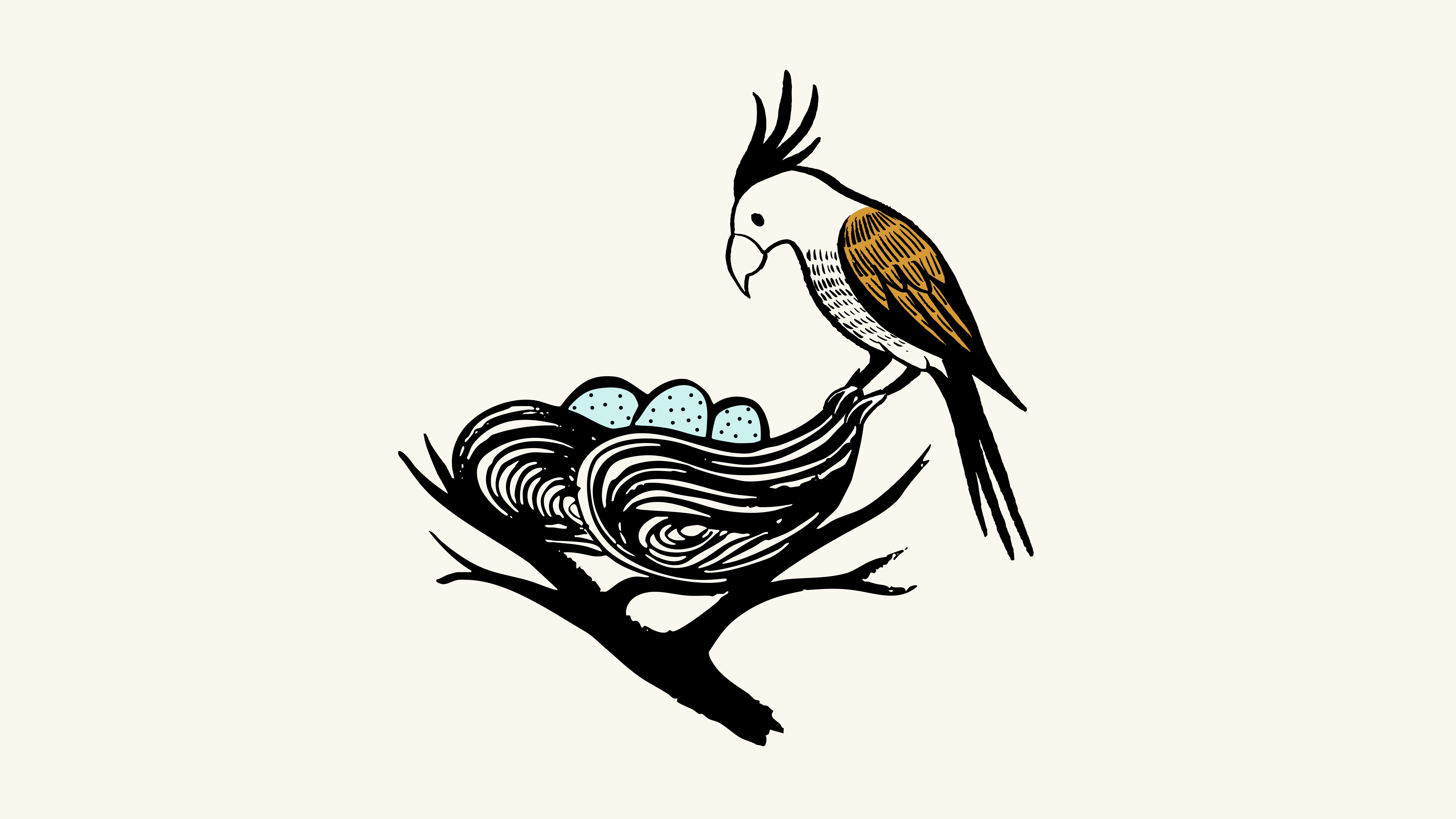
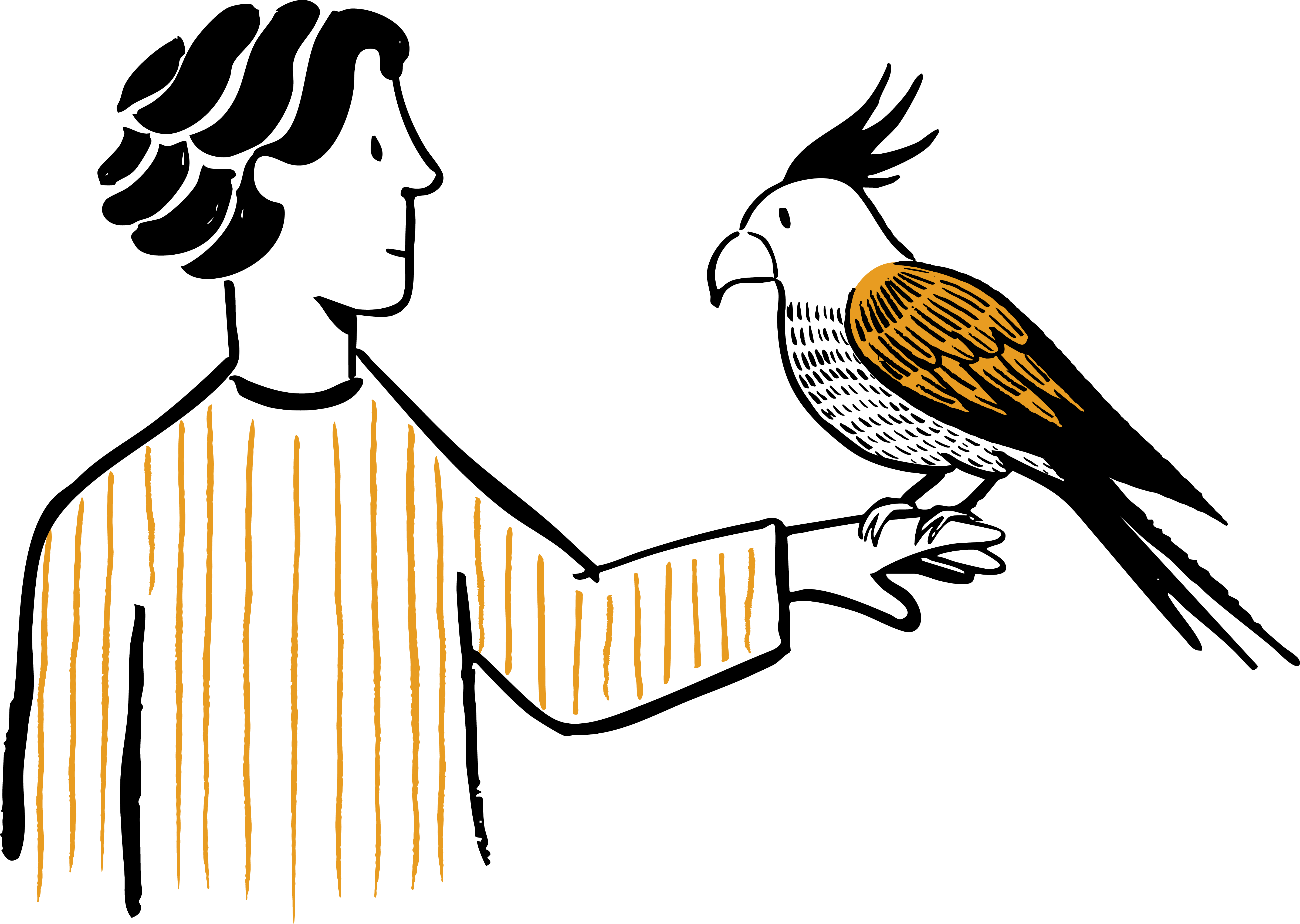
Editorial Support


Headshots on brand surfaces
Examples


Backgrounds
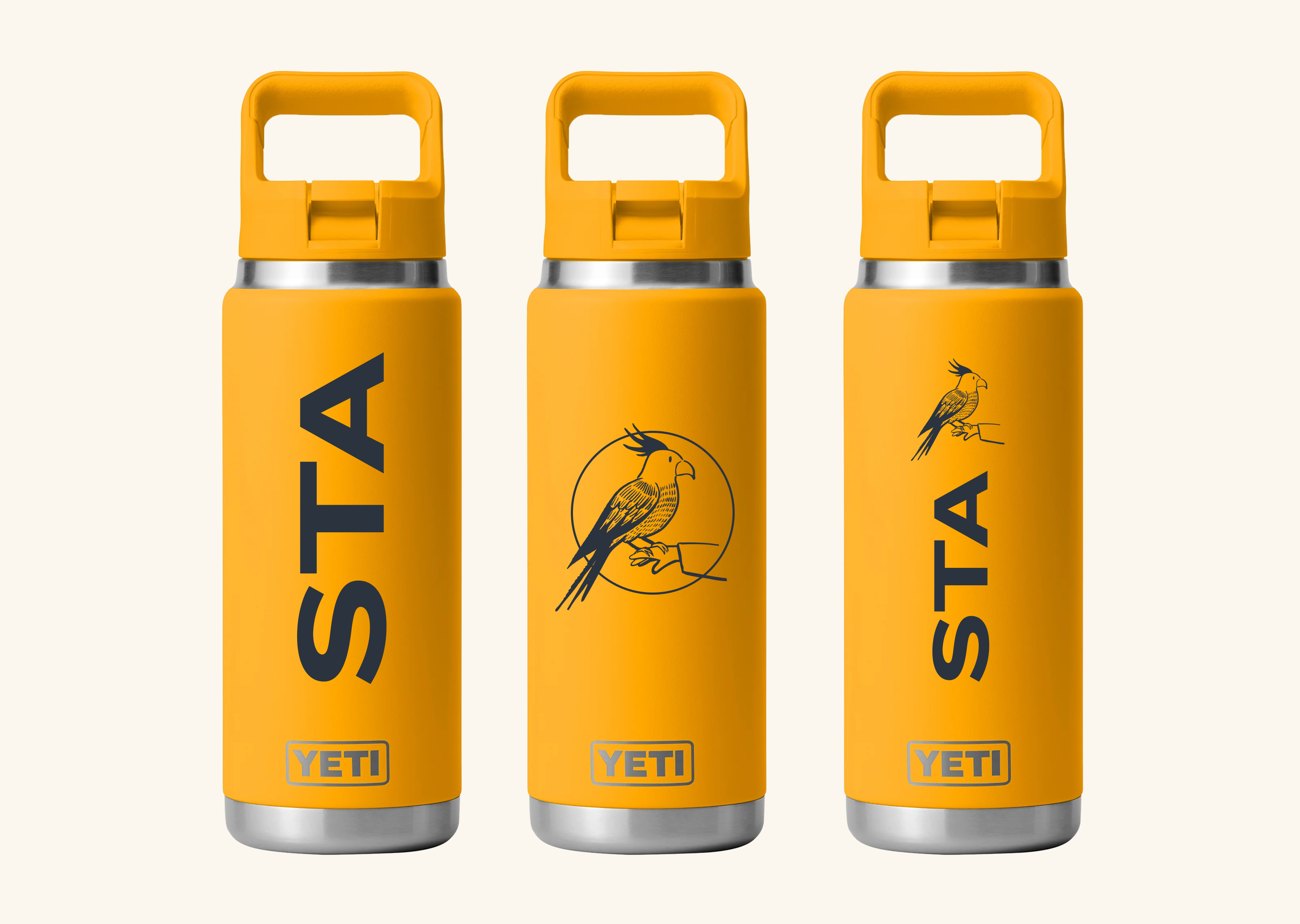
Swag References
Yeti water bottles
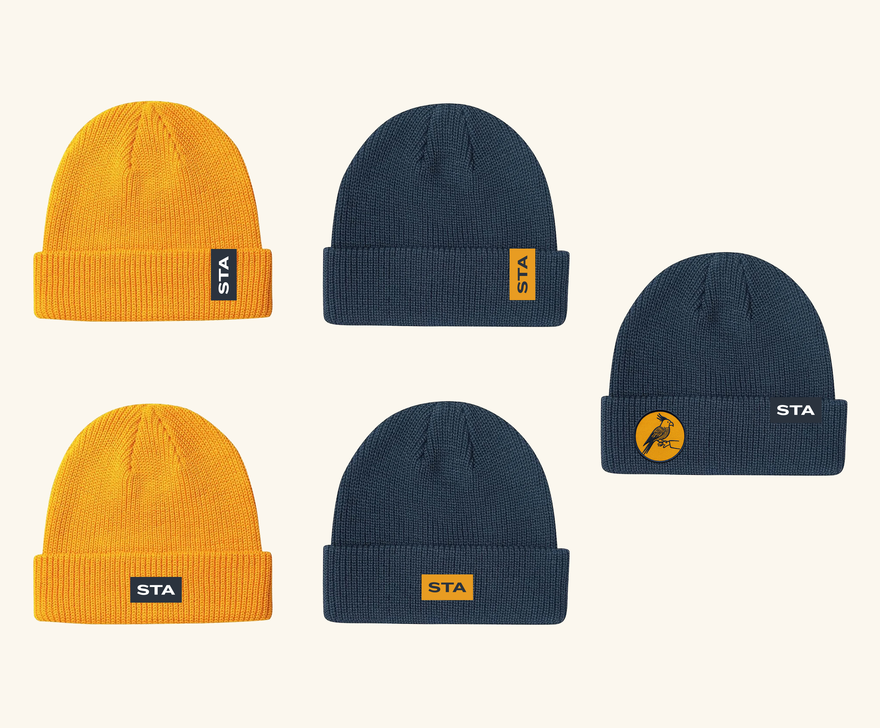
STA woven-label beanies
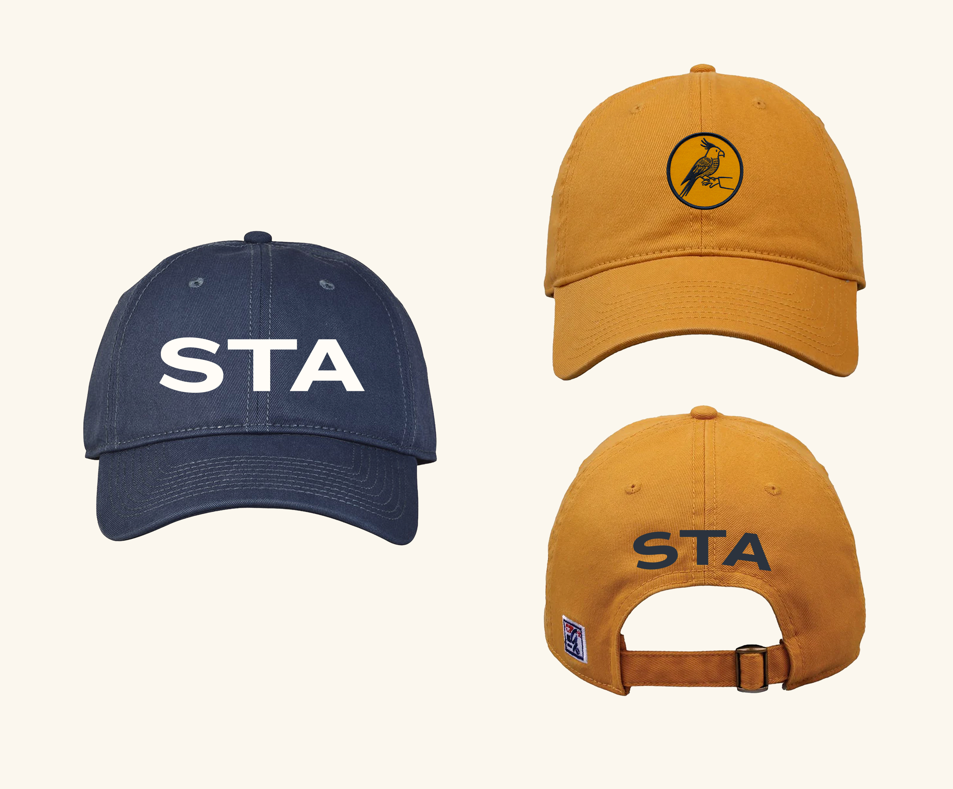
Ballcaps & bird-circle hats
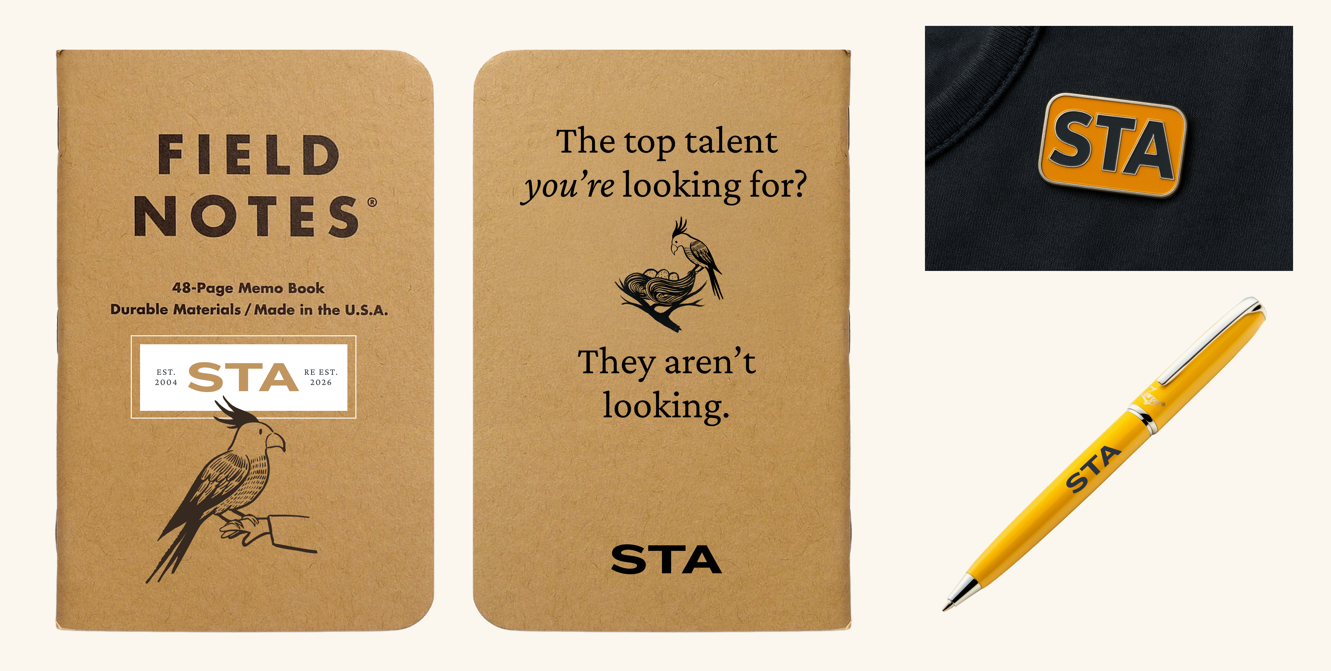
Field Notes, pin & pen
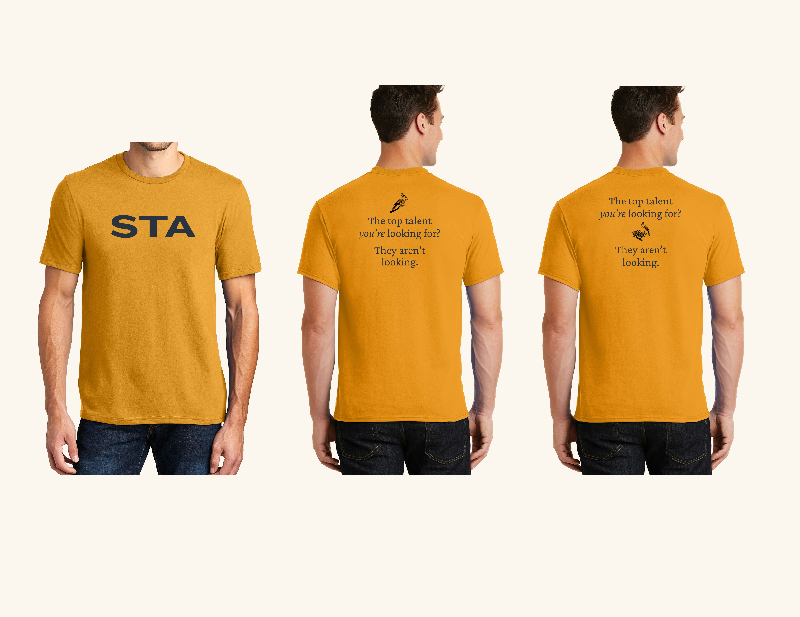
T-shirts, front & back